Looking good in PowerPoint is all about understanding masters and your templates — combined with simplicity and design flair!
We work with lots of corporate PowerPoint guidelines that struggle to work in a real-world context. Often promoting overly fussy or overcomplicated presentation designs — frustrating both seasoned presenters and occasional users. And they positively don’t project the right image!
The financial costs in personnel time — often senior — struggling with badly design templates remains overlooked, wasting valuable time and resulting in poor looking presentations, which the branding guidelines are supposed to resolve.

Corporate PowerPoint template branding and design — Does and Don’t
Usually, presentation templates are an afterthought in the branding process, shoved to the back of the design queue — tasked to a graphic artist who has never worked within the presentation or events industry. These designers often have limited experience of PowerPoint — finding it clumsy and frustrating to use when compared to professional design applications. Insufficient knowledge of PowerPoint’s functionality often results in problematic templates.
A presentation specialist is much more qualified when rebranding templates. They will know little tricks to get the best from PowerPoint.
How do you create a great PowerPoint template?
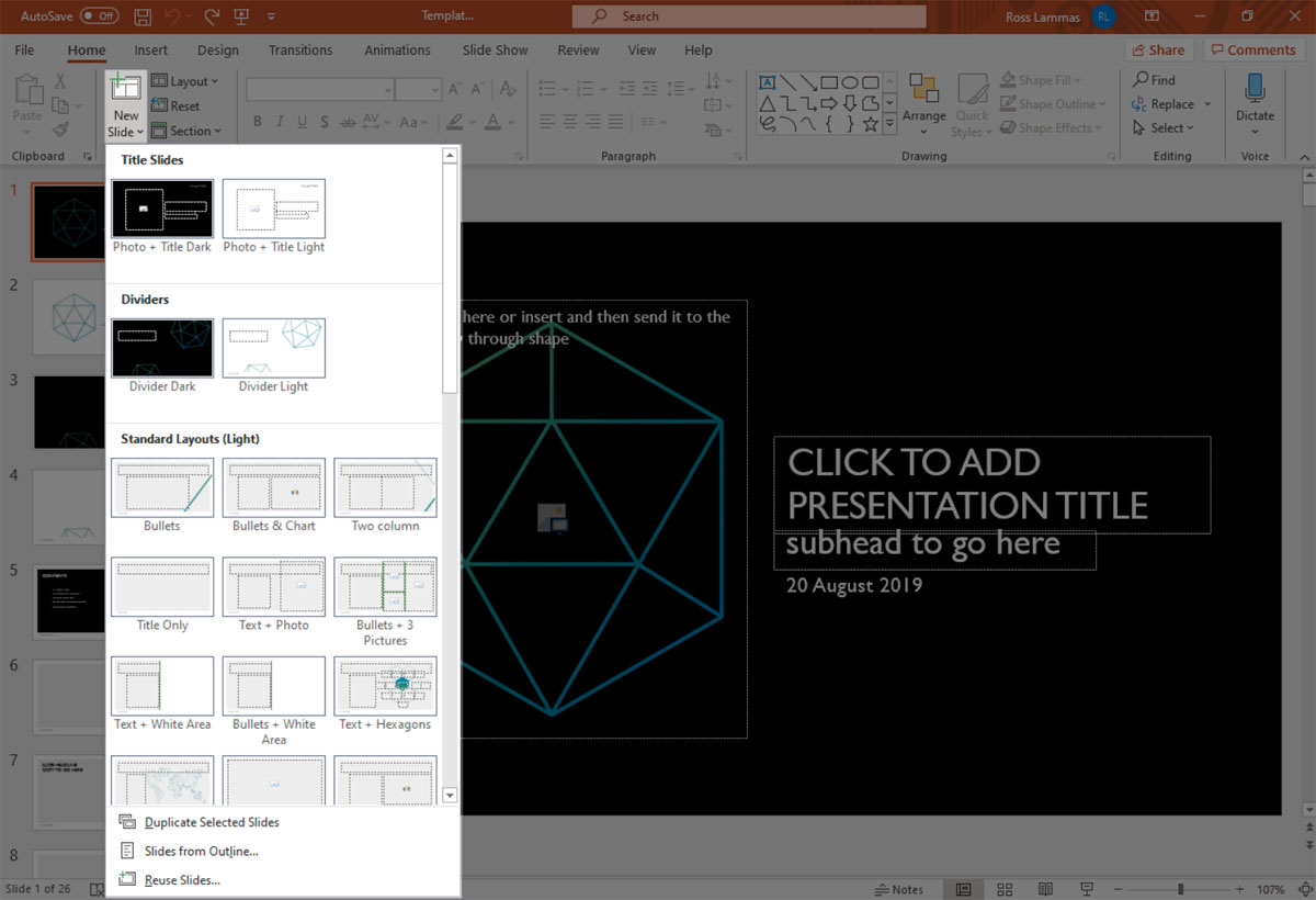
The most helpful feature within PowerPoint is the slide ‘master layout templates’ and ‘placeholders’. Slide masters allow you to style sets of standard master layouts, e.g. bullets slides, charts, images and text.
These layout masters help to dictate the overall appearance (branding) of your slides and positioning of text and tables. Information such as the font choice, styling, sizing, colourways and palettes can be embedded too.
Background image designs, logos become automatically placed in the correct position on each slide. No more headings and logos are jumping around the screen. A consistent look to charts and tables make any organisation look their best. Getting these layouts set-up and branded corrected will save hours!
Working efficiently with PowerPoint
Understanding PowerPoint slide masters function is key to working quickly and efficiently. Most presentation sent to us appears to bypass using master templates. Many users avoid the slide master, mainly due to inadequate training or unfamiliarity with the software.
Most PowerPoint users appear to type text into the first blank slide in the file, then start adding freeform text boxes and pasting charts in from other applications. Then duplicate this slides in the sorter to create yet more poorly formatted layouts, rather than creating new slides and selecting the appropriate designs.
This approach is inefficient and full of error traps. It’s easy to make mistakes. Text sizing goes astray, wrong fonts from pasted in copy appear on your slides. Misalignments issues with logos and graphics make your slides look disjointed — very unprofessional — not right!
How to use PowerPoint masters
For PowerPoint to be able to apply correct styles automatically to content, i.e. fonts, colours, design. Text and images should go into the master Placeholders fields. These are the pre-defined text, image and chart boxes with dotted borders on the blank slide layouts.
Text inserted into these master Placeholders is resettable within the layouts. Making everything line-up and stay in registration and adopting your templates branding.

Apply slide master to existing presentations
Reapplying a new design to an existing slide deck is remarkably quick if correctly formatted using masters and placeholders. That’s why they are there!
Just insert slides from an old styled presentation, choose Reuse Slides from the bottom of the menu that appears. Browse your computer to find the file containing the slides you want to import, and select the file and click Open. Automatically they will be formatted to a new style.

Any elements such as text, graphics or charts pasted directly into a slide in custom text boxes. Will not adopt the branding characteristics (fonts, colours and especially layout) defined in the layout master. Only the text assigned to placeholders will take the correct formatting.
Corporate PowerPoint branding services
Having your corporate presentation templates set-up and designed by us will undoubtedly save time. You’ll benefit from great-looking presentations that are quick and easy to format. The savings in time can be vast for any organisation.
Online PowerPoint training
We offer a full webinar training service for end-users. These sessions run through how to work with slide master and general formatting within PowerPoint. Plus tips on the best design practice for creating stunning presentations.
And for that ‘unique’ presentation or big pitch — a full visualisation, design and animation service is recommended!


